I have been accepted to Google Summer of Code!
Over the summer I will be working for Numfocus on Bivariate colormaps for matplotlib a feature that has been requested for a long time.
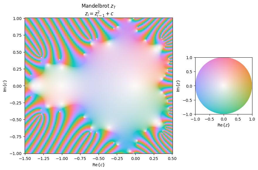
If you are not familiar with bivariate color maps, they come in handy to visualize complex numbers, here exemplified by the Mandelbrot set:
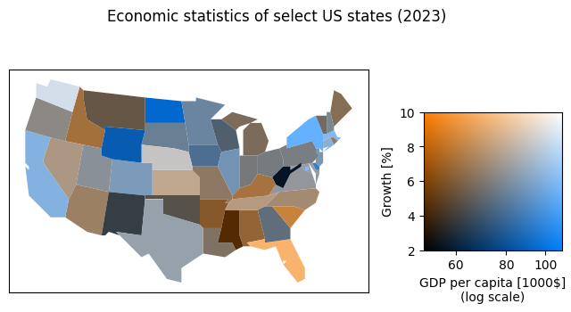
But bivariate colormaps are not limited to the number plane, and have a number of uses in different disciplines. Where the above graph shows correlated data (complex numbers), the figure below uses a bivariate colormap to visualize two independent datasets, GDP per capita, and growth (data source):
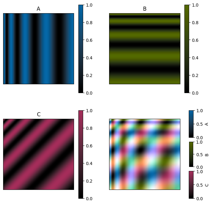
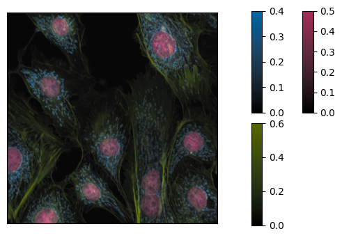
Implementing bivariate colormaps in matplotlib requires adding functionality deep in the class hierarchy. By making these changes, it will be easy to also implement multivariate colormaps for visualizing more than two images/datasets together, as with the cells shown below (data source):
There is a lot of work to be done, both on the implementation side of things, and for designing suitable colormaps. Check out the development branch if you want to compare the changes yourself!