Much work has been done in the last decade related to 1-dimensional colormaps (see for eaxmple Peter Kovesis paper and Nathaniel Smith and Stéfan van der Walts talk (2015)).
This post follows my previous post on 2D colormaps, and many of the design principles will be the same. However, with n ≥ 3, it quickly becomes unfeasible to create a full lookup table. With n = 3 channels and 256 values in each channel, the lookup table would be a matrix of 256^3 elements, likely much larger than the image the colormap is applied to. Instead, n independent 1D lookup tables are created, and the resulting colors are then combined.
The simplest approach is to assign one color channel (R, G, B) to each channel in the image; in the below image the same data is shown mapped to (R, G, B) and (G, B, R): [data source]
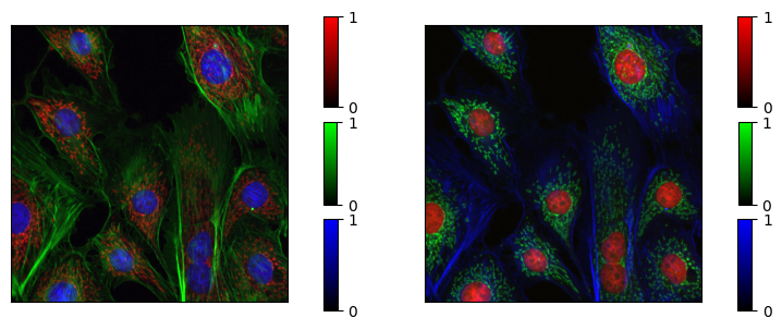
Both images above display the same data, with the same normalization, but by swapping the color different aspects are highlighted. The green channel has higher perceptual lightness and saturation, and the features of the green channel are therefore highlighted.
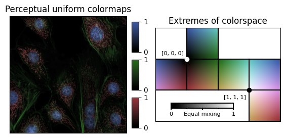
The lightness and saturation of the R, G and B channels can be visualized by displaying the three channels in a perceptually uniform colorspace.
We can define the following figures of merit for multivariate colormaps:
- Each channel should be perceptually uniform.
- All channels should have similar lightness and saturation.
- The perceptual distance between the channels should be maximized.
Since there are perceptually uniform colorspaces available in literature (for example CAM02-LCD Luo et al. (2006)), we can use these to design colormaps that match the figures of merit above:
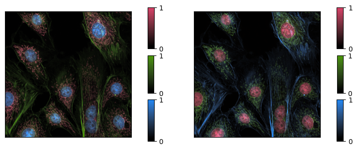
The above figure show the same data again but this time visualized with the newly generated colormaps. Again, they are shown with two different assignments to the three color channels. There are still perceptual differences, but there should be no features in the left image that are not visible in the right image. (Note that they will appear different to those that are colorblind, or if printed in black and white – more on this later.)
Combining colors
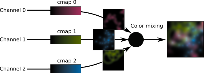
When the three channels are combined, they may produce colors that do not exist in any of the individual channels. In the above example, the colors are added, but there are a other possible blending modes:
- Additive: R = R₁ + R₂ + R₃ ← example above
- Lighten: R = max(R₁, R₂, R₃)
- Darken: R = min(R₁, R₂, R₃)
- Multiply: R = R₁ * R₂ * R₃
- Screen: R = (R₁⁻¹ * R₂⁻¹ * R₃⁻¹)⁻¹
- …
as well as more exotic ways to work within colorspace:
- Mixing in perceptual uniform space
- Non-linear mixing, e.g. R = √(R₁² + R₂² + R₃²)
- Choosing the colorbar corresponding to the highest input value, ignoring the others
- …
In terms of perceptual uniformity, it would be best to combine the colors in perceptually uniform colorspace, but there are pragmatic reasons to instead combine colors sRGB:
- The conversion sRGB ←→ CAM02-LCD is numerically costly
- The conversion sRGB ←→ CAM02-LCD is numerically unstable
- Combining colors in sRGB space gives acceptable results
It is therefore reasonable to design colormaps in a perceptually uniform space, but combine them in sRGB. However, we must be carefull to check that that this does not produce any unwanted artifacts when the colormaps are combined. This is most acute for n = 3 channels, where it is possible to create colormaps such that each color in the output image stems from a unique combination of input.
Designing colormaps with n = 3 channels
With n=3 channels, we can think of colorspace as a cube, with each channel representing one of the axes. If we are working with dense data, such that the input spans the full 3D volume of the cube, then we can add the following two figures of merit:
- Equal mixing of the components provides a grayscale
- No combination leaves sRGB space
We can visualize the colormaps above as follows:
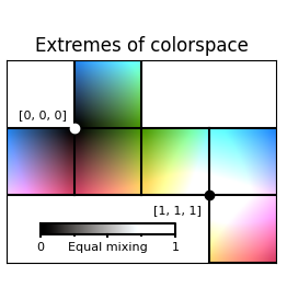
By visual inspection we can see that this is relatively uniform around the origin (black), but non-uniform around the other extreme (white), where it wants to leave the sRGB colorspace. The same can be seen in 3D, where it also becomes apparent that the “greyscale” has a weak tint.
We can adjust the colormap by reducing the maximum saturation and lightness of each channel, this to make sure the entire colormap fits in sRGB space. In the figure below the origin is fixed at (0, 0, 0) in sRGB space, and the maximum at (1, 1, 1). The grayscale has also been adjusted by minor shifts to the individual channels, so that the greyscale follows the sRGB greyscale.
This colormap fulfills all the figures of merit listed above, and will work for any 3-channel dataset. This particular example has sparse data (most pixels are only non-zero in one channel) and the resulting image therefore appears a little drab.
Colorblindness
Around 5-10% of the male population has some form of red-green colorblindness. For many of them, the colormap above looks as follows:
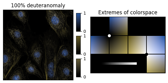
Note how the green and red channels appear almost identical. This is not an accident, but the result of a choice made when making the colormaps. The blue channel follows negative b (blue) closely in L*a*b* colorspace, and as a result the green and red channels have a very similar value of positive b (yellow). (red-green colorblindness is in practice the abscence of the a axis in L*a*b* colorspace).
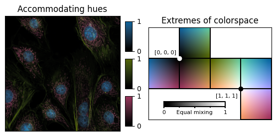
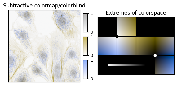
It is impossible to accommodate colorblindness completely in a 3-channel image. However, the choice made above was particularly bad. A better choice is to fix one of the channels to be along the a axis. The resulting colormap will then also have three distinct channels for those that are colorblind (grey, yellow, blue).
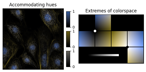
This is by no means perfect, but it is clearly a better choice.
For those of use who are not colorblind, the colormap above looks as follows:
The problem with black
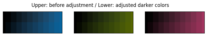
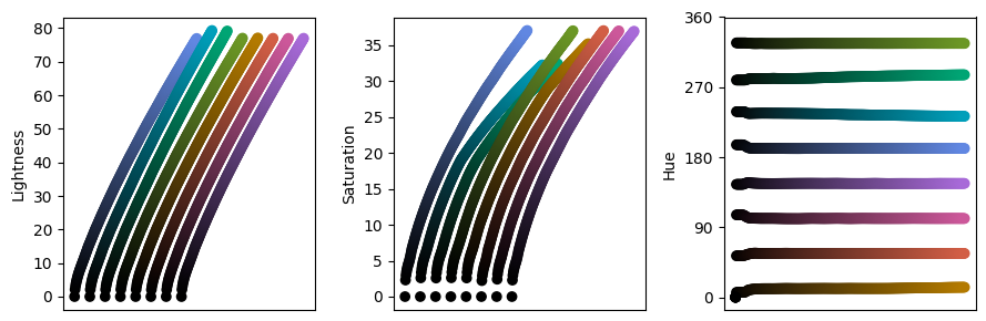
When discretized to 12 steps, the colormaps look like this:

On the right side, the individual segments can be easily discerned, but this is not true on the left, where several segments are effectively the same shade of black. I believe the issue is related to how most monitors cannot truly represent black in its purest form, and this is difficult to account for in the transformation form a perceptually linear colorspace to sRGB.
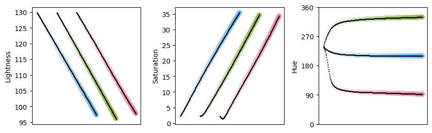
We can slighly shift the colors in the colormap in order to improve the perceptual fidelity in the darkest parts of the colormap.
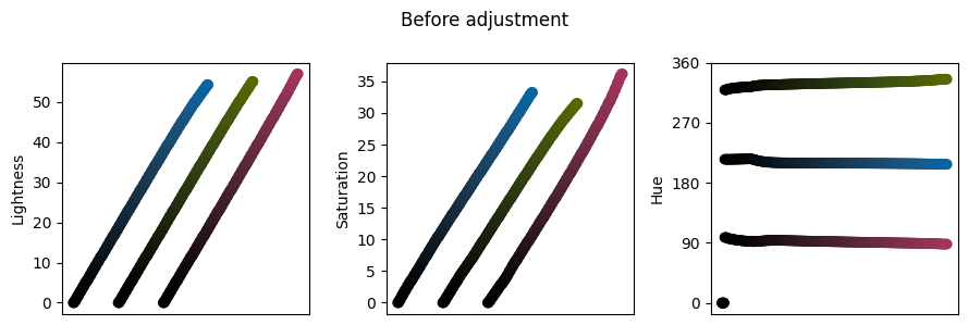
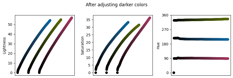
The approach used here is similar to a gamma correction, but acts independently on the lightness and the saturation. There is also a non-linearity applied when the origin is fixed to (0,0,0) in sRGB. The changes are best visualized by plotting the lightness, saturation and hue of each component:
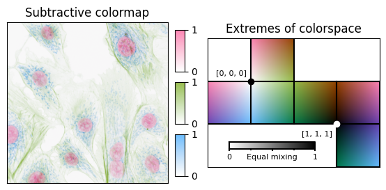
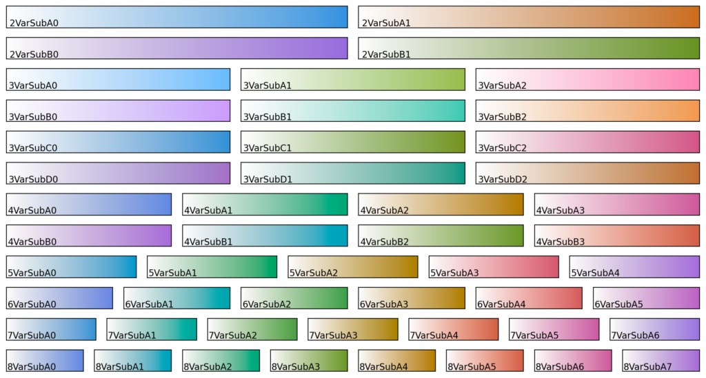
It is worth noting that this is not an issue in the bright part of colorspace, and colormaps with white at the origin perform better with regard to perceptual uniformity:
(I refer to these as subtractive colormaps, in contrast to the additive colormaps discussed so far.)

Colormaps with n ≥ 4 channels
For n ≥ 4, different each color in colorspace is no longer unique (there may be different ways to produce some of the same color in the image) and are therefore best applied only to sparse data (most pixels are only non-zero in one channel so that each pixel in the resulting image has a color close to one of the colorbars). This means that less attention should be paid to how the colormaps combine, as the combined colors are expected to rarely appear in the intended use case. We therefore use only the three first figures of merit:
- Each channel should be perceptually uniform.
- All channels should have similar lightness and saturation.
- The perceptual distance between the channels should be maximized.
Equal mixing of the components provides a grayscaleNo combination leaves sRGB space
Keeping all the other points discussed above in mind (adjusting dark colors, rotating the hues to maximize difference in color for those that are colorblind) we can produce colormaps with 4-8 colors:


We can evaluate these as we did with the n=3 colormaps, here for 4 and 8 colors.
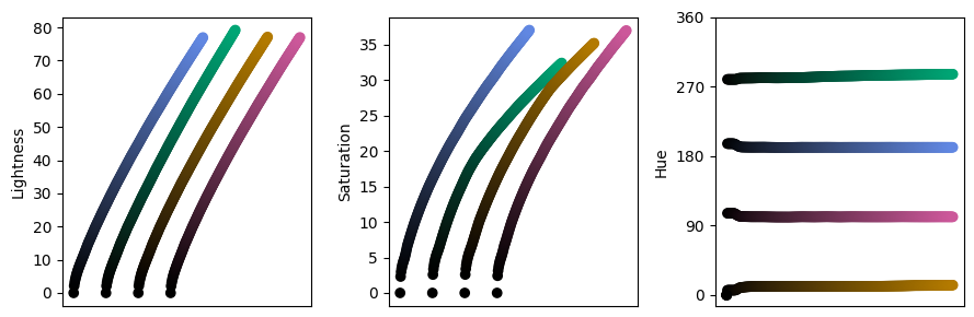
We see that in both lightness and saturation there are some inconsistencies between different colors. This is because the colormaps approach the limits of sRGB space. The inconsistencies could have been avoided by reducing the maximum lightness and saturation, which would in turn results in more dull colormaps. These colormaps are the result of attempting to strike a balance between vibrant colormaps and perceptual uniformity.
(For data that is not sparse a different combination mode may be used, but that topic goes beyond the scope of this post.)
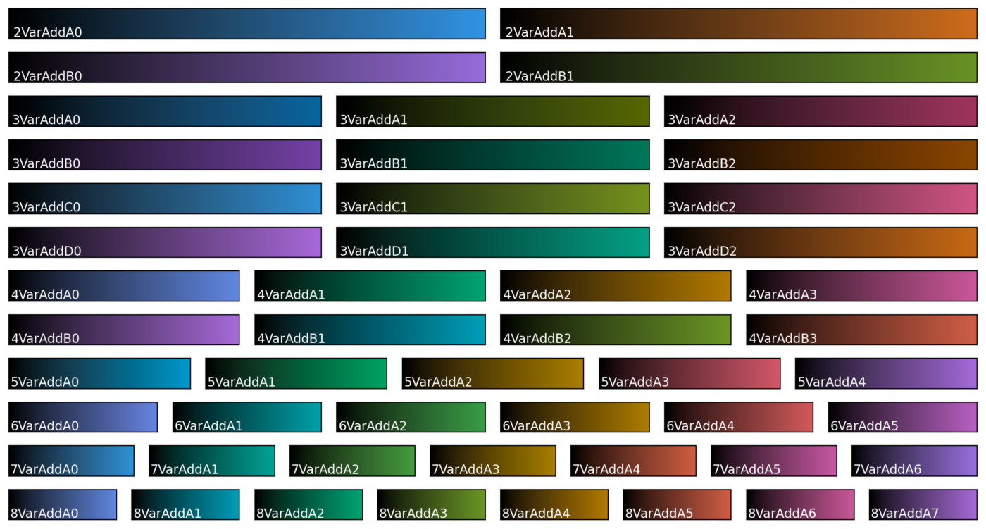
A set of colormaps with no bad choices
Combining all these together produces the following colormaps:
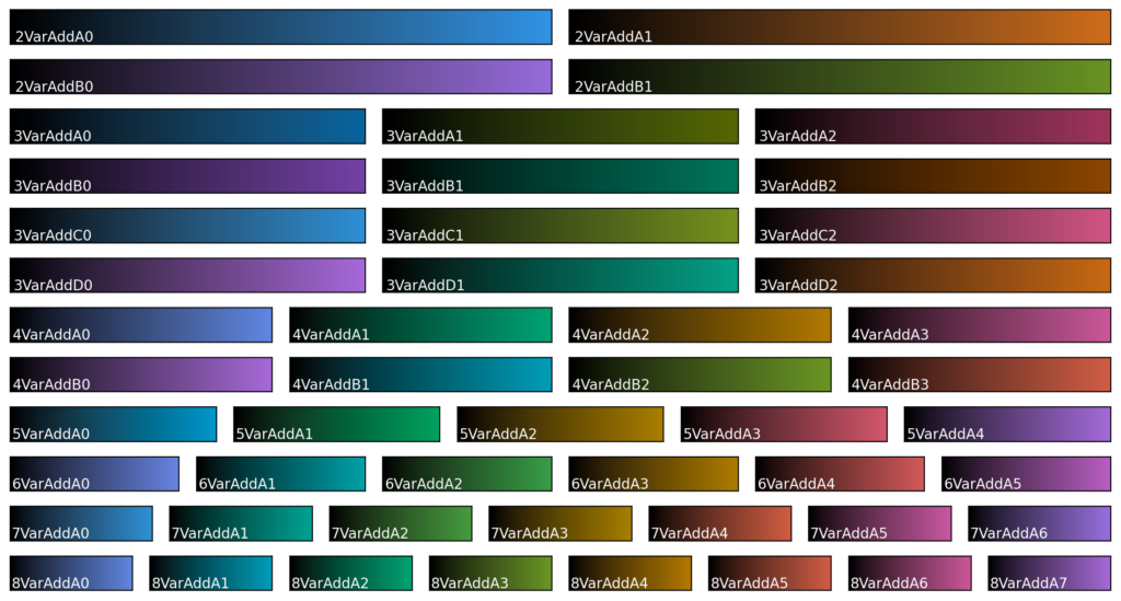
- Two (A, B) variants for n = 2 with different hues
- Both variants stay within sRGB and end at white when combined at the maximum
- Four colormaps for n = 3
- A and B are designed so that all combinations stay within sRGB space
- A and B have different hues
- C and D are designed to exceed sRGB space
- C has the same hue as A and D has the same hue as B
- A and B are designed so that all combinations stay within sRGB space
- Two colormaps for n = 4 with different hues
- Both alternatives exceed sRGB space
- One alternative for each of n = 5, 6, 7 and 8
- At n=8 is the result of combining the two sets at n = 4
As noted previously, the subtractive colormaps are more perceptually uniform:
By conforming to the figures of merit, we ensure that the most common pitfalls when choosing a colormap can be avoided. I.e. these colormaps will never be a bad choice. As such, they form a suitable basis set for general-purpose plotting software, such as matplotlib, pyplot, pyqtgraph, and others.